
BRAND GUIDE
& DESIGN SYSTEM
The definitive reference for Parlay's visual identity, voice, and product expression. Everything here exists to protect the brand's precision.
WHO WE ARE
Parlay is a field sales intelligence platform that turns reps into closers. We combine real-time data, AI-driven insights, and a mobile-first experience to help sales teams work smarter in the field.
Our brand is built on restraint. We don't shout. We don't oversell. We let the work speak. The visual system reflects this — controlled, precise, quietly powerful.
"Concrete poured over code. Luxury that works in the field."
Guiding Aesthetic PrincipleGreat tools don't need to explain themselves. Parlay is built for people who measure success by results, not promises. Every pixel, every word, every interaction is designed to earn trust through performance.
BRAND FEEL
Confident, not arrogant
Direct, not aggressive
Sharp, not cold
Premium, not pretentious
Witty, not goofy
Corporate or stiff
Overly casual or slangy
Loud or desperate
Salesy or pushy
Generic or forgettable
Deadpan. Dry. The joke is in the precision, not the punchline. Think: a perfectly timed pause, not a laugh track. If it feels like a meme, it's too much.
Think Michael Mann. Not Michael Scott.LOGO SYSTEM
The Parlay logo is always presented small and understated. It never dominates a composition. The mark earns attention through placement, not scale.
Wordmark / White
 Wordmark / Lime
 Mark / Black
Used sparingly for campaign-level work. Never in product UI. The glitch treatment adds controlled energy without sacrificing legibility.
 Glitch / White
 Glitch / Black
CLEAR SPACE
Maintain minimum clear space equal to the height of the "P" in the wordmark on all sides. When in doubt, add more space. The logo breathes best in emptiness.
LOGO MISUSE
✗ Do not apply drop shadows
✗ Do not place on busy backgrounds
✗ Do not rotate the logo
✗ Do not add strokes or outlines
✗ Do not animate without approval
✗ Do not display at large scale
COLOR SYSTEM
The base palette is monochromatic and disciplined. These are the foundation — used for 90% of all visual output.
Two accent colors. Each has a specific application context. No exceptions.
Four functional colors. They report a state or a result — they sit outside the accent system, they never decorate, and they are never a substitute for the accent.
Score bands. A score is reported in four bands. The same cuts drive the score filters and every score meter.
| Band | Score | Color |
|---|---|---|
| Excellent | 90–100 | #3B82F6 |
| Good | 80–89 | #22C55E |
| Average | 70–79 | #FBBF24 |
| Below Average | Below 70 | #EF4444 |
Score meters — the small bar under a score numeral — carry the band color. A meter in the accent reports nothing about the score.
Score gauges — the large radial dials — stay in the accent. There the number is the screen, and the band is already legible from the numeral.
Color is never the only signal. The score numeral always sits with the meter.
A status color never carries small text that would miss AA against its surface. The glyph or the meter takes the color; the numeral stays in primary ink.
The palette above is one set of colors. It is applied differently in marketing than in product, and that is deliberate — not drift.
Marketing is one column on one background. Large type, generous negative space, short dwell. A surface rarely sits on a page, so Black can be the page and contrast can run as hot as it likes. That is what the base palette assignments assume.
Product stacks surfaces on pages constantly, at small type, for hours at a time. Two of the marketing assignments break outright when carried over literally:
Surface on Black (light mode) is 1.01:1. The card and the page are the same lightness — cards become invisible but for their border.
Concrete as dark secondary text is 2.74:1. Below the 4.5:1 AA floor, and below even the 3:1 large-text floor. Unusable for the small labels that role exists for.
So product reassigns colors to different jobs. The rules below are the product contract.
Product's dark neutrals are NOT from the base palette, and that is the one place the two genuinely diverge. Page is #1C1C1C and cards are #2C2C2C — both neutral greys — where the palette's Charcoal (#1C1E19) and Surface (#242621) carry a green cast (G is their highest channel, B their lowest).
The cast measures small — about 1% on the page — but a page is the largest area on every screen, and at that scale it reads as a tint rather than a neutral. In marketing, where color is used surgically against generous negative space, the green is the point. Across a dense app used all day it becomes a wash. Going neutral also lifts cards off the page slightly better (1.22:1 vs 1.10:1, matching what iOS itself uses). The green still belongs to marketing.
Every surface, background and text color in the app resolves to one of these. Nothing hardcodes a hex. Contrast is measured against the role's own surface.
| Role | Dark | Light | Contrast |
|---|---|---|---|
| Page | Ink #1C1C1C | Surface | — |
| Surface (cards) | Ink 2 #2C2C2C | White | 1.22:1 lift |
| Recessed | Black | Charcoal | — |
| Text — primary | Bone | Bone (inv) | 13.8 / 16.8 |
| Text — secondary | Medium Gray | Concrete (inv) | 8.1 / 7.5 |
| Decorative only | Concrete | Dark Gray (inv) | 2.7 / 3.5 — not text |
| Border / hairline | Dark Gray | Charcoal (inv) | 1.41 / 1.37 |
Four rules. They resolve every question the table above doesn't.
Black (#050505) halates on OLED — light text blooms against true black — is harsh over a long session, and leaves nothing darker for recessed elements. #1C1C1C is the dark page (within a point of what iOS itself uses). Black is the recess beneath it, and the ink on Lime and Bone fills. In marketing, Black remains the page.
Surfaces get lighter as they rise toward the viewer. That is obvious in dark mode and routinely inverted in light — which is why the light page is grey (Surface) and light cards are white, not the other way round. One metaphor, both modes. The lift is intentionally subtle at 1.10:1; the hairline does the rest of the work.
Never pure white on dark; never pure black on light. Bone on Charcoal and Charcoal on Surface are the only primary text pairings. The palette supports two readable text levels, not three — for a third tier, change size or weight, never dim further.
Lime in dark, Purple in light — one role, two values. An accent that does not swap is a bug: Lime on a light interface is off-brand. The exception is a surface that is dark in both modes (the mini player bar), where Lime carries throughout. Accent is never a primary button fill; those are Bone and Charcoal.
TYPOGRAPHY
PARLAY
MAKES
CLOSERS
ALL CAPS. ALWAYS.
Used for headlines, hero text, section titles, and any moment that demands authority.
This is the primary body typeface. Clean, readable, and warm enough to feel human while maintaining the precision the brand demands.
Medium weight for emphasis within body copy. Use sparingly — it should feel like a quiet stress, not a shout.
Smaller sizes for captions, metadata, and secondary information. Regular case. Let the content do the work.
THIS IS THE ACCENT TYPEFACE
USED FOR LABELS, SECTION MARKERS, CATEGORIES, NAVIGATION, AND DESCRIPTORS
Occasionally used in regular case for longer descriptive lines where uppercase would feel strained. But most of the time: caps.
TEXTURE & FINISH
A subtle fractal noise grain is applied globally at low opacity. It creates the feeling of a physical surface — paper, concrete, film stock. The grain is never decorative; it is atmospheric.
Concrete textures may be used as background treatments for campaign materials. Keep them desaturated, low-contrast, and never competing with content. The texture should feel like a wall you're projecting onto, not a decoration.
Micro-scratches, subtle distress, film grain — these are permitted in campaign work. The damage should feel natural, like age on steel. Never digital-looking, never overdone. Think: a watch worn daily for ten years, not a Photoshop filter.
VISUAL WORLD
All photography is treated with a muted, moody filter. Desaturated, slightly darkened, high grain. Images sit in whitespace — they don't fill it. The world Parlay lives in is real, gritty, and beautiful in its imperfection.


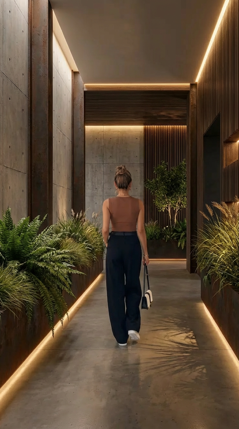
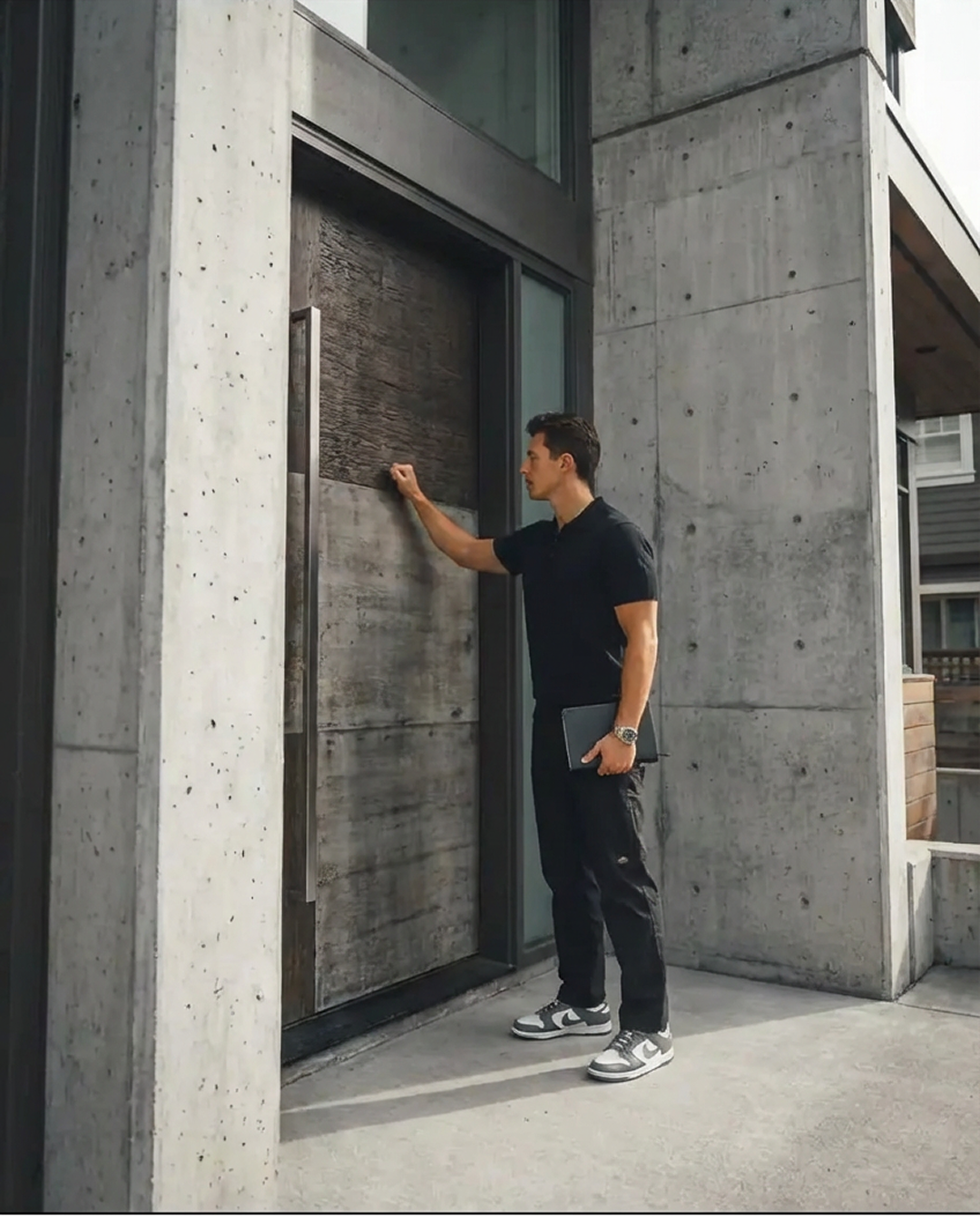


Concrete, asphalt, industrial architecture, quiet suburban streets, open skies. The environment should feel honest — not staged, not aspirational in a fake way. Real neighborhoods. Real light.
People in Parlay photography are in motion or in repose — never posed. Clothing is functional, slightly elevated. No suits. No athleisure. Think: the person who dresses well without thinking about it. Candid energy, shot like a documentary, lit like a film.
PRODUCT
PRESENTATION
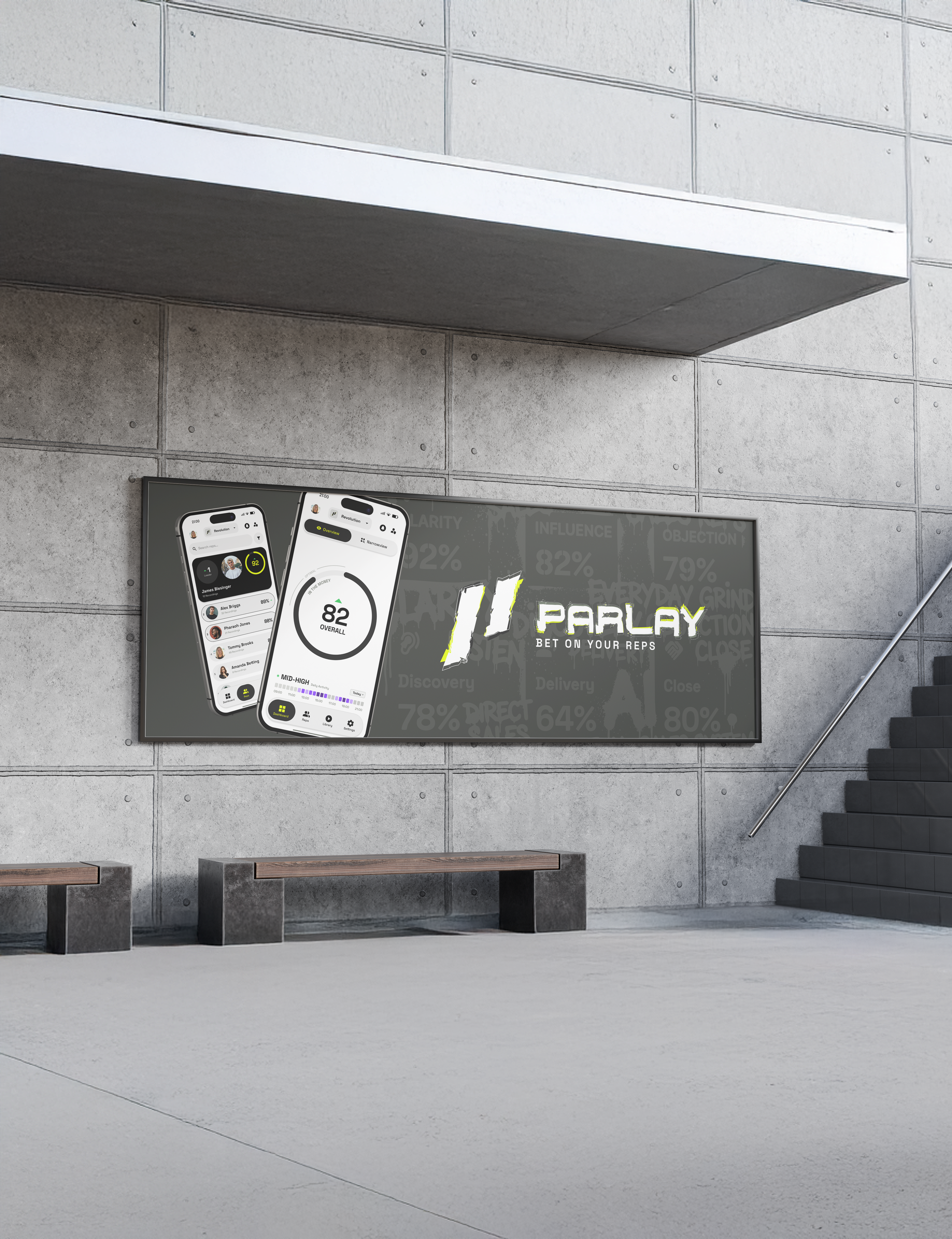
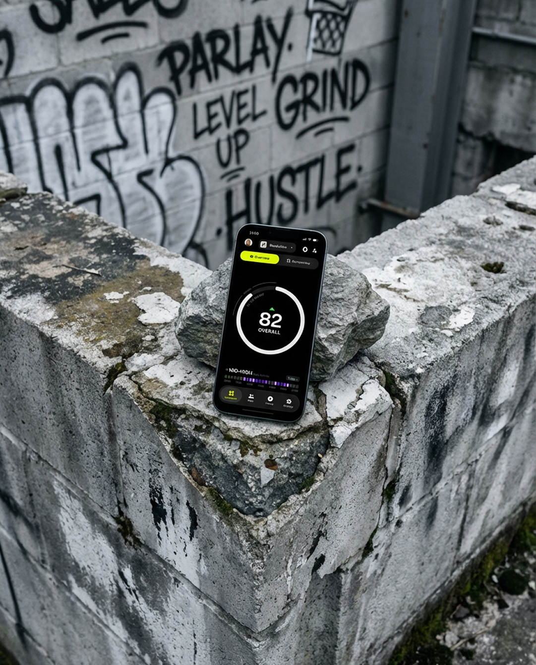
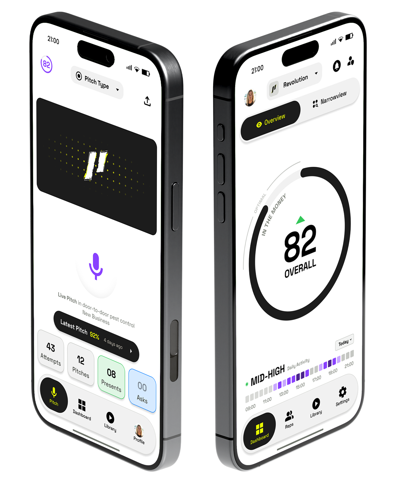
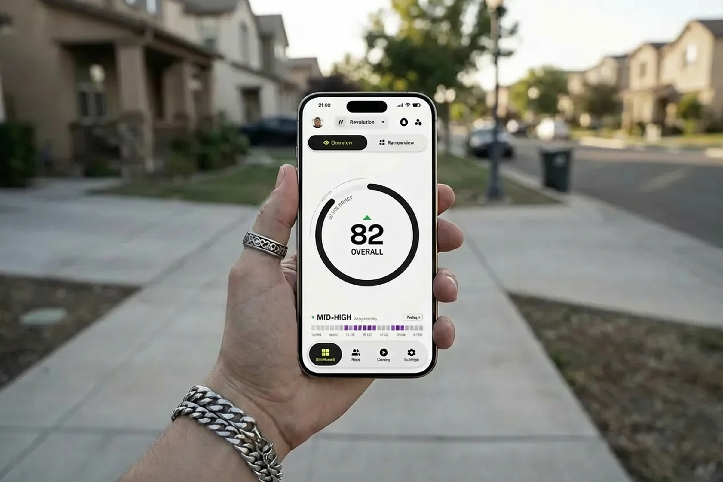
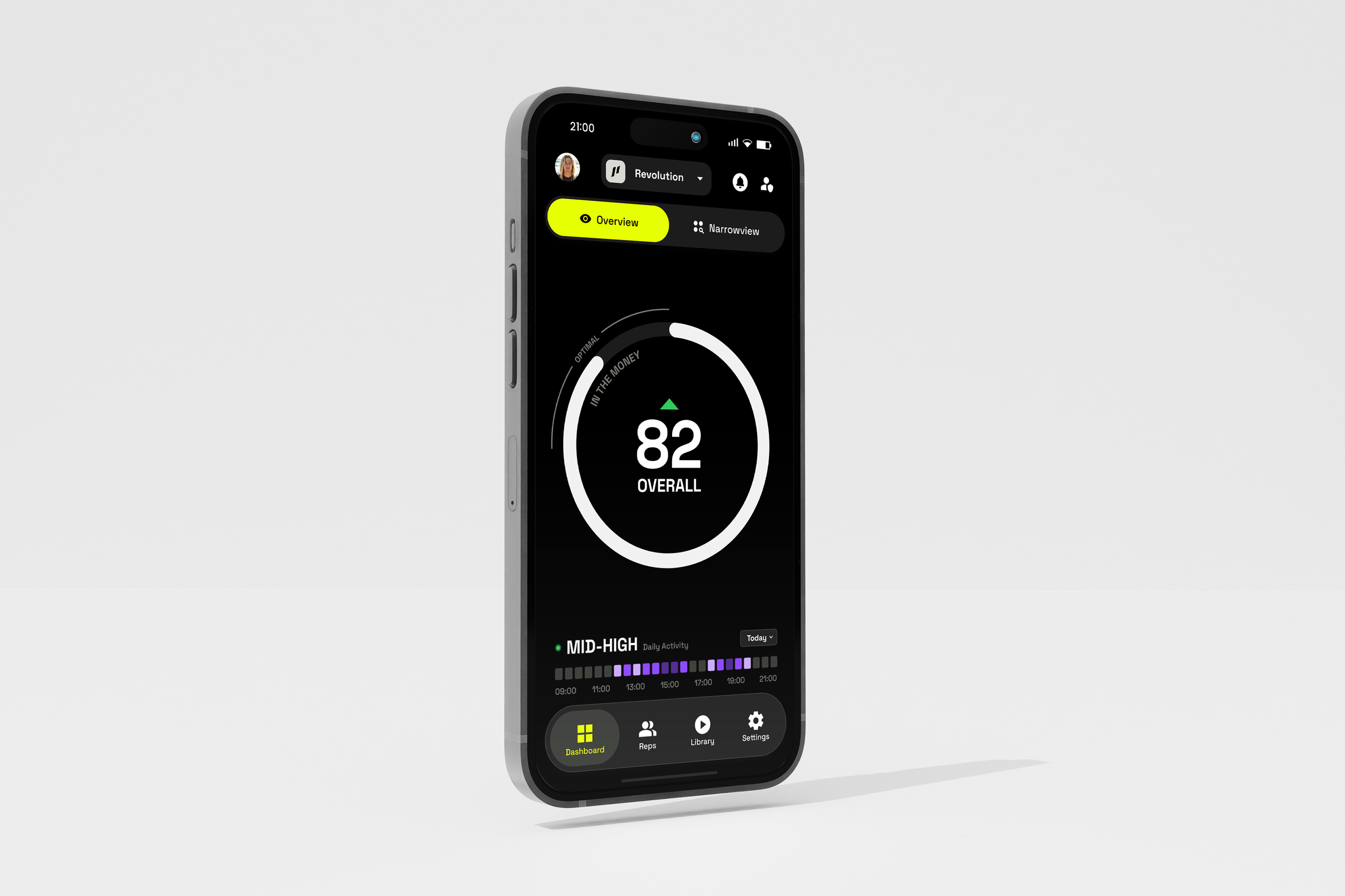
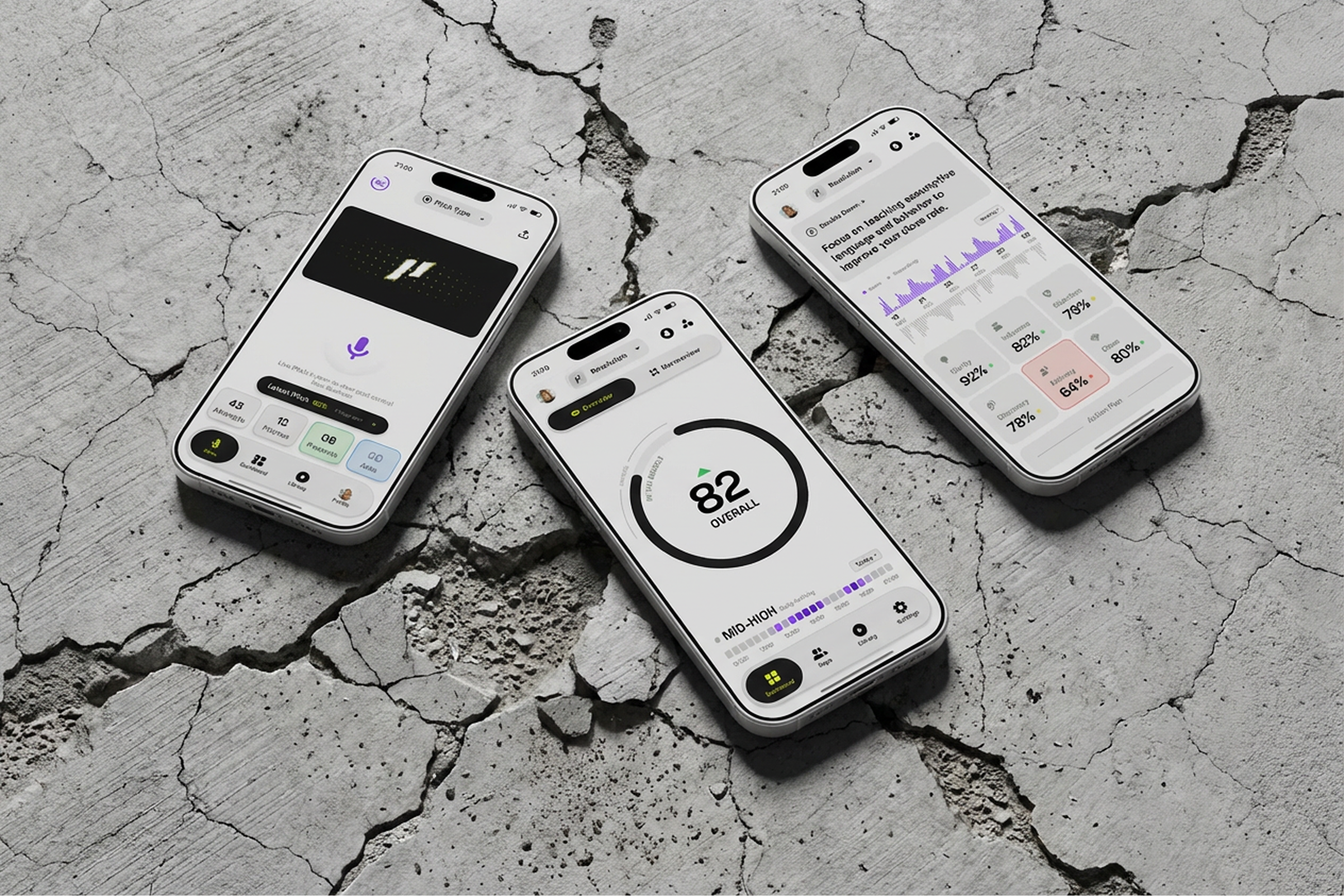
Product screens are shown on real devices in real environments when possible. Floating UI screens are acceptable for feature detail. All product imagery receives the same moody treatment as photography — desaturated, grain overlay, slightly dark.
✓ Devices at natural angles, never perfectly flat
✓ Environment context when possible
✓ Grain overlay on all product shots
✓ Muted color treatment matches photography
✗ No glossy, floating device renders
✗ No white backgrounds
✗ No stock mockup templates
PRODUCT
DESIGN SYSTEM
The iOS app is the canonical product design language. Every product surface — the app, its widgets, and the web platform — speaks this one language; web adapts it to the browser, it does not reinterpret it. Marketing surfaces keep their own rules (sections 01–09) and are out of scope here.
The same restraint that governs the brand governs the product. Controls are sharp-cornered, legible, and calm — surface, ink, and weight do the work. The accent stays surgical: focus, selection, and a single underline. Never decoration, never a button fill.
Every control is built for the field: readable in sunlight, operable with a thumb, and accessible to everyone who uses it.
Product surfaces are neutral, so photography and score color read true. Depth is a color shift plus a 1px hairline. Never a shadow, never a blur, never a material.
Background #1C1C1C dark · #F4F4F4 light — the page
Surface #2C2C2C dark · #FFFFFF light — cards & sheets
Recessed #050505 dark · #E8E8E8 light — wells, inputs, tracks
Ink Bone #F4F4E8 dark · #1C1E19 light — primary text
Secondary #BCBCBC dark · #555555 light — labels & metadata
Decorative #686868 dark · #888888 light — glyphs only, never text
Hairline #3D3D3D dark · #D4D4D4 light — 1px rules & borders
Pure white Forbidden — except ink on the purple accent
One adaptive accent: Lyric Lime #D1FF00 on dark surfaces, Purple #8941FE on light. It is spent on the focused field border, the active/selected state, and the tertiary underline — and on nothing else. Status colors (balloon blue, success, caution, error) sit outside the brand system entirely: they are functional, never decorative.
Accent Adaptive — lime dark, purple light
Static lime Only where the surface never inverts (widgets)
Static purple Analysis / AI moments in any mode
Never A primary button fill · a resting border · body text
Three faces, three jobs — never traded. Display carries headings (always uppercase) and every large numeral. Text carries prose and field input. Mono carries the machinery: eyebrows, button labels, timestamps, metadata.
Display TASA Orbiter Display — headings 18–28, scores & numerals, uppercase
Text TASA Orbiter Text — body 16, small 14, field input 16 medium
Mono Roboto Mono — labels & eyebrows 9–11, uppercase, tracked
Tracking 2px buttons & eyebrows · 1.5px field labels · 1px chips · 0.5px dense meta
Squared, 0px corners — every card, sheet, input, and button. Two sanctioned exceptions: icon buttons are perfect circles, and sheet presentation uses the device's own display radius so panels nest concentrically with the hardware. In the widget system only, the logo chip may round to 8px — the hard ceiling anywhere in the brand.
Corners 0px everywhere in product UI
Circles Icon buttons only — the one intentional circle
Sheets Presentation radius = device display radius (concentric)
Widgets 8px maximum — hard no above
Depth Color shift + 1px hairline — no shadows, no materials
Five text-button styles, one job each. Never more than one primary action in a single view — hierarchy is what makes the primary read as primary. Labels are always Roboto Mono, uppercase, 11 / 2px tracking.
Solid bone fill on dark, charcoal on light. Full-width by default. The one action that matters — one per view.
1px outlined, ink label. Standard actions that support the primary path.
Text over a 2px accent rule. The only accent allowed on any button. Tertiary and skip moves.
Solid functional red. Only for committing an irreversible act — never for opening one.
Bare mono label in secondary ink. Cancel, Done, and other low-emphasis moves.
The whole card or list row is the button — full-surface tap target, pressed dims.
Icon buttons are always perfect circles — the one intentional circle in the system, and it never carries the accent. Two variants (solid, outlined), three sizes chosen by role, never by taste. The glyph is 40% of the diameter.
Small 40 Chrome & inline — toolbar, sheet close, row actions
Medium 46 Standalone — filters, inline play, hardware toggle
Large 56 Dominant — record button, hero play
Solid Bone fill, ink glyph · Outlined 1px ring at 28% ink
Every interactive element declares all five states. Focus is never removed — it is how keyboard and switch users move through the interface.
Fill Bone on dark, charcoal on light — no accent, no glow
Label Roboto Mono, uppercase, 11, 2px tracking
Height 44 default — 36 / 44 / 52 scale
Corners Squared — 0px, always
Pressed Opacity dim (0.6–0.82 by style) · Disabled 0.4
Focus Web: 2px surface + accent double ring, never removed
Sheets and dialogs share one vocabulary: a mono eyebrow over a 1px rule, an uppercase Display title, prose in secondary ink, actions stacked full-width. The committing action lives in the sheet footer as a primary button — never in a navigation bar.
Name Your List
Give the playlist a name your team will recognize.
Header Eyebrow mono 9 / 2px track · title Display 22 bold uppercase
Close Solid small icon button (40), top right
Footer 1px rule, then a full-width primary · Cancel is a text button
Radius Sheet presentation = device display radius · content squared
Dialog Max 340 wide · scrim black 55% · tap-out dismisses
Severity Destructive is a property — red eyebrow + rule, red commit only
Fields are recessed wells with a mono eyebrow. The accent marks exactly one thing: the focused field's border. Sections separate with rules, not boxes. Filters take three shapes by the shape of the choice — a menu row for single-select, a toggle for booleans, chips for multi-select.
Field 52 tall · recessed fill · 1px hairline · input Text 16 medium
Eyebrow Mono 10 / 1.5px track, uppercase, secondary ink
Focus Border becomes accent — the only accent in a form
Editor Multi-line 150 min · hairline stays neutral
Sections Mono eyebrow + 1px rule · destructive sections tint red
Chips Selected = accent fill + ink · unselected = hairline + secondary
Cards are surface-on-background with a 1px hairline, 14px padding, squared. The recording card sets the data convention: an uppercase Display title as the primary line, and a single mono meta line — rep · duration · age — at 9px with dot separators. Scores render in Display with tabular digits above a tier-coloured meter; the accent is spent only on the score gauge, a radial dial of 72 squared ticks sweep-filled with it.
Card Surface fill · 1px hairline · padding 14 · playing = accent border
Title Display 15 semibold uppercase
Meta Mono 9 · dot separators · one line, never two
Score Display bold, monospaced digits · 40×2 tier meter (see Score Bars)
Gauge 72 squared ticks · accent sweep · Display center numeral
The hero score surface, and the one place the accent is spent on a number. A radial dial of 72 squared ticks that sweep-fills as the score counts up. No ring, no gradient, no shadow — the ticks are rectangles and the accent alone reports progress. The leading tick is wider and longer, so the sweep has a head. Tapping (clicking) replays it.
There is exactly one gauge. Every dimension scales off a single size value, so the same component serves every context rather than forking — the four sizes below are the four call sites in the app, not four components.
Size ladder — every call site in the app, shown to scale.
Trend marker — sits above the numeral, and is omitted entirely when neutral rather than drawn as a flat dash.
Ticks 72 · width 2px · head 3px · squared, never rounded
Length Rest size×0.045 · filled ×0.065 · head ×0.095
Inset size×0.055 from the edge
Numeral Display bold at size×0.22 · tabular digits · counts up
Eyebrow Mono at max(8, size×0.033) · uppercase · tracking 2
Label "Overall" everywhere except the 160 compact form, which reads "Score"
Sweep 12ms stagger per tick · eyebrow fades in at 60% of the sweep
Empty #3C3C3C dark · #E0E0E0 light · a non-zero score always lights 1 tick
Web Pointer · focus ring · Enter/Space replay · haptics drop away
The compact score readout, used anywhere a gauge would be too loud. A flat track with a tier-coloured fill and the numeral directly above it.
The fill reports the band, not the brand. Painting these in the accent told you nothing about the score — every recording looked identical — so the accent stays reserved for the gauge, where the number is the screen. Colour is never the only signal: the numeral is always directly above the bar.
Two sizes, and only two. The 3px bar fills its card; the 40×2 bar is fixed-width because it sits in the 46px score column of a list row, where a flexing bar would ragged the column.
Score block states — the 46px column carries four, and the bar appears in only one of them. The column keeps its width in all four so a list never ragged.
Bands 90+ #3B82F6 · 80–89 #22C55E · 70–79 #FBBF24 · <70 #EF4444
Heights 3px fluid (sub-score card) · 2px at a fixed 40px (list row)
Track Secondary ink at 15% · squared · no rounded caps
Numeral Display bold 24 (card) / 22 (row) · tabular · always above the bar
States Scored · processing · no-speech glyph · "--" — column width never changes
Never Accent fill · rounded caps · colour as the only signal
— Rep
The rep's own library card. Score block left at a fixed 46px so every title in a list starts on the same vertical. Title is the only Display line; everything else is mono meta at 9px.
Four blocks below the top row appear conditionally — deal buttons, a transcript snippet while searching, a no-speech banner, and a pending row with a force-process action. They are mutually exclusive in practice: a recording is either scored, silent, or still working.
Card Surface · 1px hairline · padding 16 · squared · gap 12
Score Fixed 46px column · Display 22 bold · 40×2 tier meter
Title Display 15 semibold uppercase · one line, truncated
Meta Mono 9 uppercase · duration · deal status · social right
Double Down 14 secondary · max 2 lines · only when analysis returned one
Deal buttons Off by default · on only where the rep triages outcomes
Snippet Search only · match highlighted on the accent
Web Hover lifts the hairline to secondary ink · focus ring · pointer
— Admin, Playlist,
Feed
One card, three contexts, driven by a style value rather than three components. The layout never changes; what changes is which elements earn their place.
Each toggle exists for a reason worth stating. Playlist drops the second row because the whole card is a tap target that opens the recording and is long-pressable to reorder — an inline disposition menu could never open, since the card's tap wins the gesture first. Feed drops the rep name and age because the post header directly above already carries both, and it demotes disposition to a read-only badge: the outcome is real context in a feed, but changing it belongs in the detail view, not in a social post.
| Element | full | minimal | feed |
|---|---|---|---|
| Row 2 — disposition menu + comments | Yes | — | — |
| Rep name & age on the meta line | Yes | Yes | — |
| Read-only disposition badge | — | — | Yes |
Title Display 15 semibold uppercase · falls back to the rep's name when a recording has none
Meta Mono 9 · 3px dot separators · rep name truncates first so length and age survive
Score Same 46px block as the rep card · "--" when unscored
Playing Accent border replaces the hairline while the card is the active track
Web The gesture conflict that forces `minimal` on iOS does not exist with a pointer — but the card stays consistent across platforms rather than re-adding row 2 on web only
— All-Day Session
A session is a container of captured segments rather than a single take, so this card reports a count and a progress percentage where the others report a duration. Three states: idle before anything is captured, live while recording, and complete once every segment is scored.
Title Display 14 semibold idle · 15 once the session has content
Count Mono 9 · "n Captured" · medium weight once non-zero
Progress Mono 13 bold · percentage, not a bar — the bar means score here
Padding 16×12 idle · 16 once populated
Active Accent border · live marker replaces the score block
— Orphaned
Recovery rows in the orphaned-recordings modal. These are files found on disk with no matching record, so there is no score and no title to show — only what can be read off the file. The row is a selection control, not a link: it carries a checkbox and a play toggle, and nothing navigates.
Row Surface · hairline · selected = accent border + elevated fill
Primary Display 13 — duration stands in for a title there is none of
Meta Mono 9 · file size · captured-at
Check 18px square · squared, never a circle · accent fill when on
Play Icon button · swaps to pause while this row is the active track
— Champion
Rank 1 only, and deliberately not a bigger version of the podium row — it is a different block. An accent rule caps it, the avatar doubles to 64px, and the score is the one number in the entire leaderboard rendered in the accent. Everything below it stays monochrome so this reads as first place at a glance.
Rule 3px accent bar across the top — the only full-width accent in the list
Avatar 64px squared · mono 16 initials
Eyebrow Trophy glyph + "Champion" · mono 10 bold uppercase
Name Display 22 bold — larger than any other row
Score Display 40 bold, in the accent · "Score" eyebrow beneath
Container Elevated fill · 1px hairline · padding 18 · no rank numeral
— Rep Rows
Full-bleed rows separated by a hairline — never boxed cards. The field stays quiet so the rows that matter can carry weight: the podium (ranks 2–3) gets an elevated fill and larger avatar, name and score; the viewing rep gets a stronger fill plus a 3px accent stripe that finds them wherever they land.
Rank is Display for the podium and mono for the field — the typeface itself says whether a row is a placement or a position. Avatars are squared and monochrome; there are no per-user colours. The timeframe rides along only on highlighted rows: repeated down every row it stops being information and becomes wallpaper.
Status badges mark reps who are not yet ranked. These are the only non-accent, non-status colours in the product, and they appear nowhere else.
Row Full-bleed · 1px hairline under · padding 14 (16 podium)
Rank 30px column · Display 20 bold podium · mono 12 field · 2 digits · em dash unranked
Avatar 40px (44 podium) · squared · monochrome · mono 12 initials
Name Display 15 semibold uppercase (16 podium)
Score Display 18 bold (20 podium) · tabular · trend triangle beneath
Trend Up accent · down secondary · neutral omitted
Current rep Elevated fill · 3px accent stripe · accent rank · YOU chip
Web Rows are links: pointer, focus ring, hover fill one step up
— Admin Performer
The compact form used inside admin dashboard panels, where a leaderboard is one module among many rather than the screen. It carries a name and a single metric string — no rank, no trend, no score block — because the panel it sits in already states what is being ranked.
Avatar 32px squared · mono 10 initials
Name Display 13 uppercase
Metric Mono 9 · a free string — the panel names the measure, the row carries the value
Omits Rank, trend, score meter, timeframe
The six pillars every recording is scored on — Clarity, Influence, Objection, Discovery, Delivery, Close — in a three-column grid.
Detail opens inline, never in a modal, and it opens directly beneath the row containing the tapped tile, pushing later rows down. That placement is the whole point: the feedback appears next to the tile it belongs to, so the score and its explanation are read together. A modal would cover the other five pillars and break the comparison the grid exists to support. Tapping the open tile again closes it.
Grid 3 columns · 8px gutters · short rows keep the 3-column width
Tile Surface · padding 12 · squared · icon 24 · title 12 medium
Value Display 24 bold + 8px status dot
Status 80+ accent · 65–79 secondary · <65 #EF4444
Critical Red fill at 10% + 2px red border — the tile itself raises the alarm
Open 2px accent border on the tile · panel under its row
Panel Surface · 3px accent left edge · padding 14 · mono 11 title · Display 22 score
Web Real buttons · aria-expanded · arrow keys move between tiles
The pillar's other form — used on the rep's own recording detail rather than the team grid. Same six categories, but this one carries a tier meter instead of a status dot, and it marks the single weakest pillar with a Focus chip. That chip is the app's Double Down: the one pillar with the most to gain.
Selected and lowest-score both draw an accent border; selected draws it at 2px so the two states remain distinguishable when they land on the same card.
Card Surface · padding 12 · squared · 1px hairline
Icon 18px · secondary ink
Category Mono 9 uppercase · tracking 0.5 · one line
Score Display 24 bold · tabular · 3px tier meter beneath
Focus chip Mono 7 bold on the accent · lowest-scoring pillar only
Borders Accent 1px when lowest · accent 2px when selected
Admin dashboard headline numbers. Not a pillar and not a score — the value is a free string, so it holds percentages, counts, and durations alike. No meter and no status dot: these are magnitudes, not scores, and there is no band to report.
Card Surface · padding 16 · squared · left-aligned
Title 13 secondary — sentence case, not the mono eyebrow voice
Value 24 bold · free string, so units live inside it
Trend Diagonal arrow at 14 bold · up or down only, never neutral
Omits Meter, status dot, band colour — a magnitude has no tier
Tab bar Outline glyph at rest, filled when selected — weight, not just color
Nav bar Opaque, hairline shadow · title Display semibold · back label Mono 13
Scrolling Indicators hidden product-wide — the transcript's gauge is the exception
Keyboard Tap-away and scroll both dismiss · Done accessory on iPhone only
The lock screen, Dynamic Island, and home widget run a static, dark-only edition of the system: ink ground, lime for live, purple for analysis, amber for paused. Nothing animates on the lock screen — the only motion is the OS-ticked timer. The rounded-8 logo chip is the single rounded corner in the entire brand.
Timer Roboto Mono, OS-advanced, bounded to the 8h recording ceiling
Status Lime live · amber paused · purple analysis · red error
Motion None on lock screen — static dots, no waveforms
Mark Lime chip, 8px radius — the brand's hard ceiling
Web product surfaces (platform, console, dashboard) speak the app's language at 1pt = 1px, then add what a browser demands: hover states, a visible focus ring, and a pointer cursor. Nothing else changes — same faces, same squared geometry, same accent discipline.
Hover Primary dims slightly · outlines sharpen to full ink
Focus Double ring — 2px surface, then 2px accent · never removed
Context Dark console = lime · light wizard = purple — same swap as the app
Grain 4% noise overlay on dark web surfaces only — never in the app
Accessibility is precision applied to people. These are non-negotiable for every interface Parlay ships.
✓ 44×44px minimum touch target
✓ Visible focus ring, always
✓ Text contrast meets WCAG AA
✓ State shown by more than color
✗ No color as the only signal
✗ No hover-only actions
✗ No removed focus outlines
✗ No product text under 11px
The same component in both systems. Lime carries the accent in dark interfaces; purple carries it in light. Structure, type, and spacing never change — only the surface and the accent.
Default for the app and admin surfaces. Built for low light and glare. Lime marks the live status and the leading rep — buttons stay bone.
For the onboarding wizard, reports, and daylight readability. Purple takes the accent role; the primary button turns charcoal.
One product language, one marketing language, a hard boundary between them. When a surface is ambiguous, ask what the person is doing: operating the product → product system; being persuaded → marketing rules.
iOS app Product system — the canonical implementation
Widgets / LA Product system, static dark edition
Web platform Product system + web adaptation (wizard, console, dashboard)
Marketing site Marketing rules — sections 01–09, not this system
Email / PDF Marketing rules
CONTENT PILLARS
FIELD INTELLIGENCE
Data that lives where your reps live. Not in a dashboard — in the field.
"Your CRM doesn't knock doors. Parlay does."REP EMPOWERMENT
Tools that make good reps great and great reps unstoppable.
"We don't replace reps. We arm them."OPERATIONAL EDGE
The margin between winning and losing is measured in minutes. We optimize those minutes.
"Speed isn't a feature. It's the product."RESULTS CULTURE
We celebrate outcomes, not effort. The scoreboard is the only metric that matters.
"Talk is cheap. Close rates aren't."LUXURY RULES
Parlay doesn't flex. It implies.
Luxury in the Parlay system is defined by absence, not addition. What we remove is more important than what we add. Every element must earn its place. If it doesn't serve the message, it doesn't exist.
01 Whitespace is the primary design element
02 Typography carries the weight, not imagery
03 Color is used surgically — never decoratively
04 Motion is subtle, purposeful, never playful
05 Every element has a reason to exist
Let content breathe
Use restraint as a feature
Trust the typography
Leave things unsaid
Design for the second look
Fill every pixel
Use gradients or gloss
Add decorative elements
Over-explain
Design for applause
HARD NO'S
THE PARLAY
SYSTEM
Use this scale to evaluate any piece of creative work against the Parlay brand system. A score below 7 requires revision.
| Score | Rating | Description |
|---|---|---|
| 10 | Perfect | Could be in a brand case study. Flawless execution. |
| 8-9 | Strong | On brand with minor opportunities for refinement. |
| 7 | Passing | Acceptable. Meets minimum brand standards. |
| 4-6 | Weak | Off brand. Needs significant revision before use. |
| 1-3 | Reject | Does not represent Parlay. Start over. |